In today’s data-driven world, decision-making is reliant on the ability to make sense of vast amounts of information. Effective data representation thus becomes a crucial skill as it allows us to comprehend, interpret, and analyze data better. One of the tools used for this task is the radar chart. In this article, we delve deep into the concept, workings, applications, and intricacies of a radar chart.
Grasping the Core: Understanding How a Radar Chart Works
 Image by pressfoto on Freepik
The working mechanism of a radar chart is fairly straightforward. Each axis represents a different variable. Each value is marked out on the appropriate axis and then all these values are joined up to form a polygonal shape. Essentially, the further away from the center of the chart a data point is, the higher the value it presents.
A radar chart manages to convey a considerable volume of information on a multiple-variate system in a relatively small visual space. This encompasses both comparisons of aggregate values of variables and individual ones.
To interpret a radar chart, one considers the position of the data points on each axis. This allows for a comprehensive comparison across categories as well as variables. When the chart is used to compare two or more substantive measurements, one can easily discern the disparities in the data’s distribution.
Read also: The Different Types of Graphs or Charts That Present Financial Data on a Website
Dive Into Details: Breaking Down Radar Chart Components
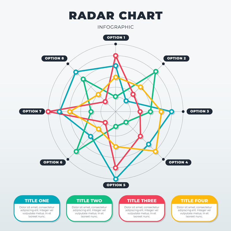 Image by Freepik
Understanding the components of a radar chart is pivotal to unlocking the full potential of this versatile data analysis tool. The chart is typically divided into quanta lines (circular), axes lines (radiating from the center), and axes labels to show the scale on each axis.
The number of axes in a chart is generally equivalent to the number of characteristics or performance indicators being evaluated. These go from the center point outward. The point where the axes meet at the center depicts the lowest possible value, while the end of the axes shows the maximum value.
Data points are plotted along each axis, according to the value they represent. The plotted points are then interconnected to form a polygon. The resulting polygon offers a visual clue to the shape and variance of the data set.
Various colors, lines, and shapes are used to distinguish between different data sets, whilst data set variance is displayed as filled or unfilled polygons.
Misconceptions and Precautions in Using Radar Charts
 Image by gstudioimagen on Freepik
While radar charts offer many advantages, there are also some potential pitfalls and misconceptions to be aware of. One of these is the phenomenon of “attribute framing,” where the interpretation of results can vary depending on the sequence of the variables. Consequently, analysts should be careful about the order in which the variables are presented.
Additionally, if there are too many variables, the chart can potentially become cluttered and challenging to interpret. It’s therefore essential to strike a balance between including enough variables for comprehensive analysis and keeping the chart readable and insightful.
Another common issue in radar charts occurs when variables are of different scales. This can cause some variables to dominate others, which could lead to over-emphasizing the significance of certain variables over others. To prevent this, one must ensure that all variables are normalized to the same scale before plotting.
Final Thoughts
Ultimately, like any other data analysis tool, the effectiveness of radar charts lies in the hands of the user. It’s crucial to understand the underlying principles, applications, pros and cons, as well as the potential pitfalls to effectively interpret and use radar charts.